One of India's oldest and most trusted crypto exchange that brings 0 fee trading experience for the users.
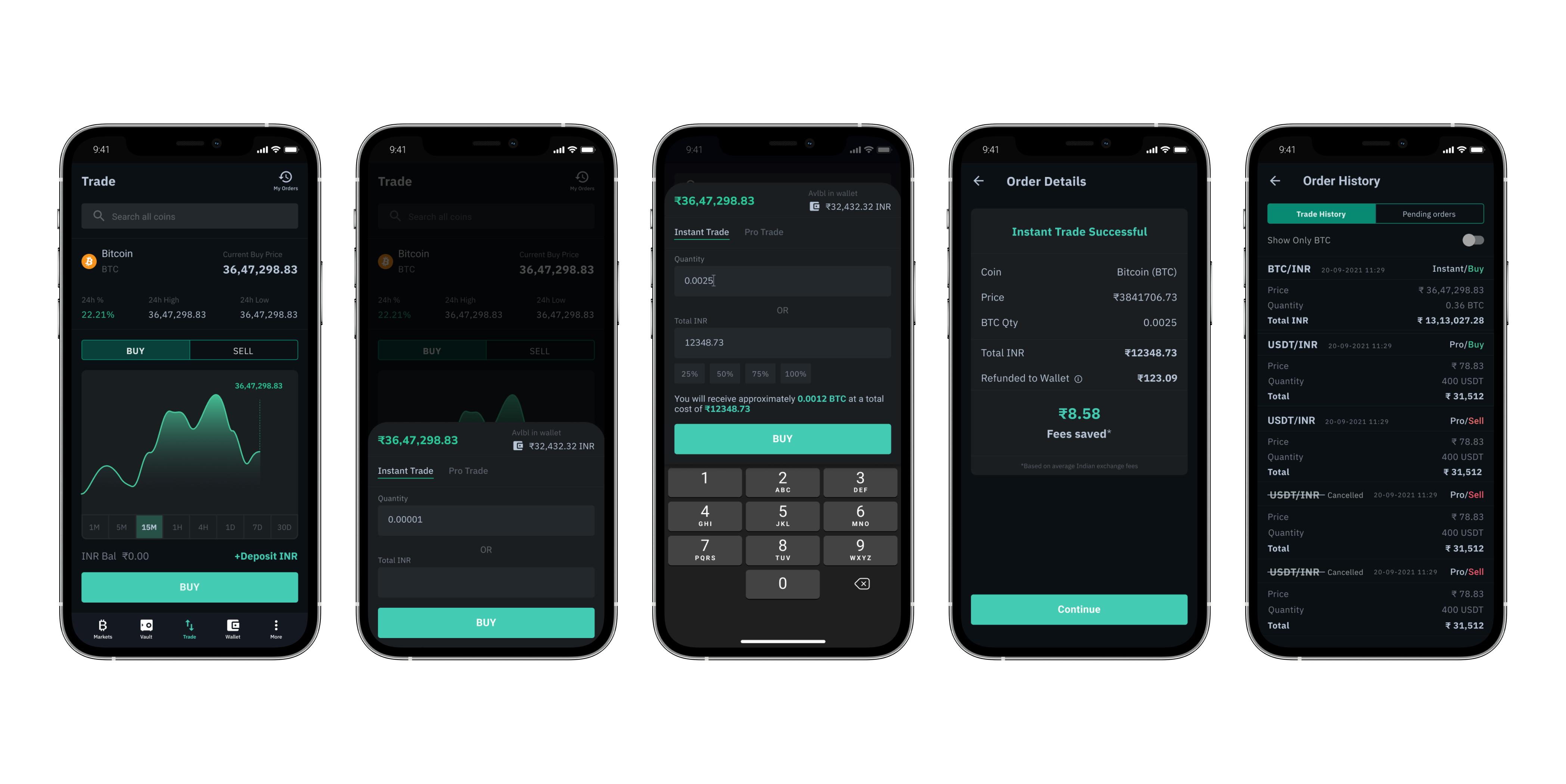
Being the first design hire at PocketBits I've across full product life cycles. Helped ideate new concepts & design user experiences. Worked closely with the marketing and engineering teams to ship products successfully.
My Responsibilities:
• I helped build and lead the design team.
• User research, defining user personas, and creating user flows.
• Wireframing, UI design, and prototyping possible solutions.
• Redesigned the web app.
• Designed v1 and v2 for PocketBits App.
• Helped redesign the complete web experience.
This stage involved studying the $2.5T cryptocurrency market. The Cefi market was already being dominated by exchanges like Binance, Coinbase, FTX, Kucoin, etc. So it was important to make innovations that could significantly improve the user experience.
1. From analytics data, we found that users spent 80% of their time on trade & portfolio pages.
2. Trade pages on other exchanges were not focusing on user engagement.
Pocketbits is one of India's oldest crypto exchanges. The design was targeted to help first-time investors buy crypto. Less than 1% of Indians bought cryptocurrencies. The design of the app was kept beginner-friendly considering the huge untapped crypto market in India.
The research involved studying the Indian crypto market to identify problems faced by Indian retail traders.
Problems found:
1. There were no platforms in India that helped traders arbitrage successfully by comparing prices of assets across all exchanges.
2. Crypto news was too technical for the average retail trader to understand. No products provided curated content which can have market impications.
I start every project on paper sketching out possible flows. This is where most design iterations happen.
Every successful trade showed the amount saved during the transaction to reinforce the USP -- zero trading fees.
Innovation zone was designed for inexperienced traders so could easily differentiate high-liquidity assets from low liquidity assets so that they don't lose money because of a lack of awareness.
We chose warm brand colors to stand out because using cool colors (shades of blue, green, and violet)was the convention.
1. Since users spent 80% of their time hopping between trade and portfolio pages we went ahead to merge the two.
2. To increase engagement on the trade page we added a live-chat feature.